

Responsive design quality depends on how well a website helps people use its content across screen sizes. A layout should preserve meaning, keep controls reachable, and support the tasks visitors came to complete. Appearance is one part of that review.
This guide explains what to check in layouts, content, navigation, forms, and loading behavior. Use real pages and a repeatable task list. That gives your team a practical way to evaluate the result and decide which improvements matter next.
Define responsive design quality through tasks
First, choose the main reasons people visit your site. They may need to read a guide, compare a service, select a product, or send an inquiry. Write down what successful completion looks like.
Then select pages that represent those needs. For example, include long text, several images, a form, and any complex navigation. A polished homepage alone does not show how the rest of the website behaves.
Also identify the environments you will review. Include narrow, intermediate, and wide screen sizes, plus browsers relevant to your audience. Also, record the coverage so approval has a clear scope.
Review responsive layouts with actual content
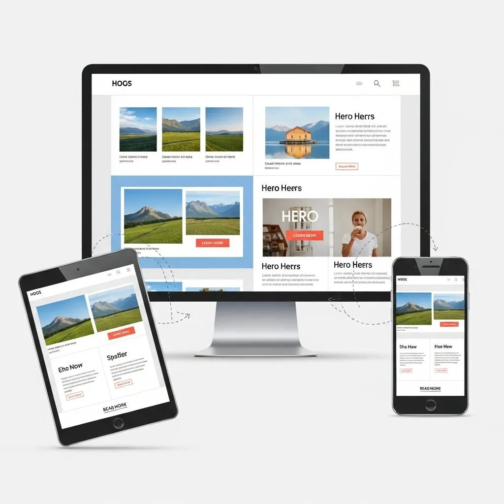
Flexible layouts allow sections to resize and rearrange as space changes. In particular, check whether the reading order remains understandable when columns stack. A heading should stay connected to the content it introduces.
Next, use real headings, tables, images, and embedded media. Long text may expose an issue that demonstration content hides. Look for clipping, overlap, or unnecessary sideways scrolling.
For background, consult MDN’s responsive design guide. Choose layout adjustments based on the content and problem you observe. Avoid assuming that one screen width represents every phone.
Check navigation for responsive design quality
Use labels that describe menu destinations and group related pages together. As a result, visitors should understand where a link leads before following it. Keep the route to important information clear.
Then test the mobile menu during a complete task. Open it, follow a link, and return to the page. Confirm that it closes predictably and does not leave essential controls covered.
- Use specific wording for important actions.
- Leave useful space between touch controls.
- Keep keyboard focus visible.
- Review sticky headers and overlays.
Make responsive content readable
Responsive design quality includes the words and images inside the layout. Use headings that summarize the next section and paragraphs that develop one idea. For example, put useful information close to the task it supports.
Next, check images at different sizes. In particular, preserve details that matter and keep captions understandable. Essential instructions should remain available as text rather than only inside a shrinking graphic.
Also write accurate alt text for meaningful images. Do not repeat a search phrase in every description. Image descriptions should explain what matters in the page’s context.
Verify forms and accessibility

For example, complete a representative form on a phone with the keyboard open. Check visible labels, reachable controls, and errors that explain how to recover. Also, review the final confirmation as well.
Then navigate important pages with a keyboard on a larger screen. Check the order of controls and visible focus. A page that fits the screen can still create obstacles for someone using another input method.
These checks are useful starting points, while a complete accessibility assessment has its own scope. Record what was reviewed and what remains unresolved. Avoid treating visual consistency as proof of complete accessibility.
Include performance in responsive design quality
A flexible layout does not automatically load quickly. Observe what appears late, moves during loading, or responds slowly after interaction. Review the whole visitor task rather than only the first screen.
Next, investigate the relevant cause. Images, widgets, scripts, and server behavior may need different changes. Also, keep features purposeful and review unused additions carefully.
Before changing settings, keep a backup and use a test environment where available. Make a focused adjustment and repeat important tasks. A faster report does not justify a broken form or menu.
Document findings and verify fixes
Record the page, environment, steps, expected behavior, and actual result. Include a screenshot when it explains the issue. Next, assign an owner and a priority based on the visitor task affected.
After a fix, repeat the original steps and check related pages. A change that improves a phone layout should not make the desktop layout harder to use. Finally, keep the verification result with the issue record.
Finally, review key journeys after content and software updates. Our digital marketing services can help connect website priorities with business needs. Responsive design quality supports useful experiences, but it does not guarantee rankings, satisfaction, or sales.
