
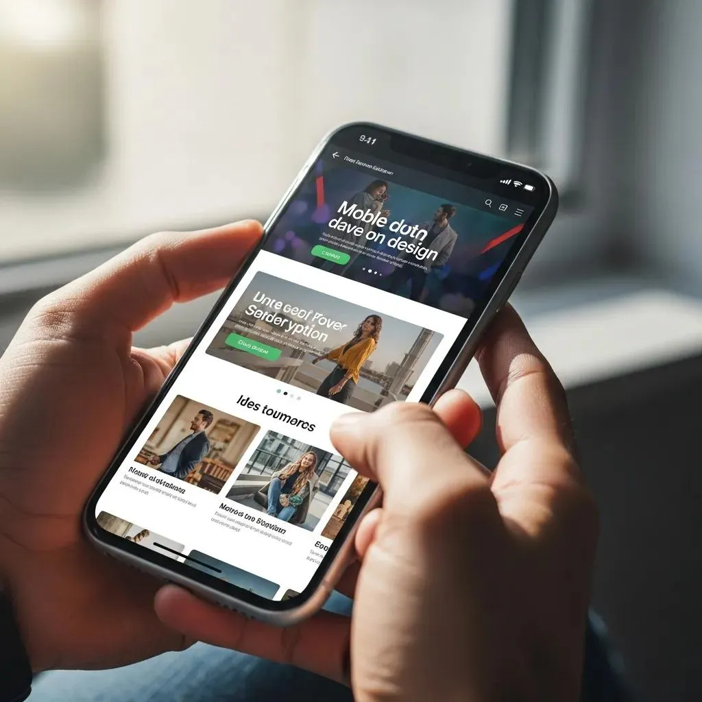
Mobile-first user engagement starts with helping people complete useful tasks on a small screen. A clear answer, an understandable menu, and a working form can matter more than a visually busy page. Begin with those needs before expanding the layout for larger screens.
This guide explains how to connect content, controls, performance, and testing with meaningful engagement. It also shows how to interpret reports carefully. A design approach can remove obstacles, but it does not guarantee that visitors will stay longer or buy more.
Define mobile-first user engagement goals
First, choose a few important visitor tasks. Someone might compare a service, find a location, ask a question, or select a product. Describe what a successful outcome looks like for each one.
Then list the information needed to make the decision. Put useful details close to the relevant action. For example, explain what an inquiry form is for and what happens after submission.
Also decide what evidence you will review. Completed tasks, customer questions, and errors can provide context that visit duration alone cannot. Keep these goals in the project brief so design feedback stays focused.
Make mobile engagement easier with clear content
Use headings that summarize the section below and keep paragraphs focused. Visitors should be able to scan a page and find the answer they need. Avoid delaying useful information with a long promotional introduction.
Next, review the page with actual text and images. Long headings and detailed explanations may behave differently from demonstration content. Check that essential information remains available at every screen size.
For mobile-first user engagement, a concise page still needs enough detail to support a decision. Remove repetition while keeping useful explanations. A shorter page is not automatically a more helpful one.
Use responsive layouts for mobile engagement
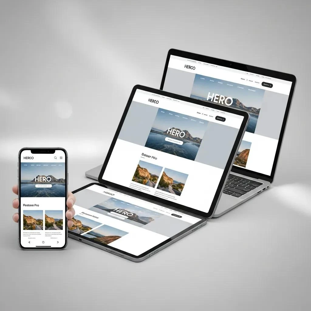
A flexible layout adapts to the available width. Columns may stack and images may resize, but the reading order should remain understandable. Keep a label connected to the information or control it explains.
Then review narrow, intermediate, and wide layouts. Look for content that overlaps, headings that collide, and unnecessary sideways scrolling. Check tables and embedded media as well as ordinary paragraphs.
For background, consult MDN’s responsive design guide. Use the relevant principles to solve the problems in your own pages. The final task experience matters more than the name of a layout technique.
Make actions predictable
Mobile engagement depends on controls people can understand and reach. Use familiar menu labels and specific button wording. A label such as “Send inquiry” explains more than a vague “Go.”
- Leave useful space between touch controls.
- Keep important actions near supporting information.
- Make menus easy to open and close.
- Check that overlays do not cover the next step.
Also complete a form with the on-screen keyboard open. Review visible labels, errors, and the final confirmation. Visitors should know how to correct a mistake and whether their request succeeded.
Review performance during real use

Mobile-first user engagement can suffer when useful content appears late or controls respond slowly. Observe a normal visit and a complete task. Note delays after interaction as well as at the start.
Next, investigate the relevant cause. Large images, extra widgets, slow requests, and other factors may need different changes. Avoid assuming that a responsive layout automatically makes the page fast.
Before changing settings, keep a backup and use a test environment where available. Make a focused adjustment and repeat important tasks. A faster measurement should not come at the expense of a working menu or form.
Include accessibility in the review
Navigate important pages with a keyboard and check visible focus. Review the order of controls, useful link names, and form labels. These checks can expose obstacles that a visual review misses.
Also write accurate alt text for meaningful images and keep essential instructions available as text. Do not rely on color alone to explain a state or an error. A complete accessibility assessment has its own scope beyond these starting checks.
Record issues with the page, environment, steps, and expected behavior. After a fix, repeat the same task and check related pages. This gives the team a clear record of what was verified.
Measure mobile-first user engagement in context
A long visit can reflect interest or confusion. A short visit can reflect a quick answer or an early exit. Compare reports with the visitor’s goal and direct observations where practical.
Then record campaigns, content changes, and other business factors before attributing a result to design. Track useful inquiries, completed actions, and customer feedback alongside traffic. Avoid assuming that one metric proves satisfaction.
Finally, use the evidence to choose the next improvement. Our digital marketing services can help connect mobile website work with broader business priorities. Bring specific pages and visitor tasks so the discussion starts with concrete needs.
