

Responsive design and user engagement connect through practical visitor tasks. A page that adapts to a phone can make information easier to read and controls easier to reach. However, fitting the screen does not automatically make the content useful or the journey clear.
Start by identifying what visitors need to accomplish. Then review layouts, navigation, content, and forms together. This guide explains how to improve those experiences and measure results without assuming that longer visits always mean greater satisfaction.
Connect responsive design and user engagement to tasks
First, list the reasons people come to your website. They may need a quick answer, a product comparison, or a way to contact your team. Different tasks require different amounts of time and interaction.
For example, someone finding your phone number quickly may have a successful short visit. Someone spending several minutes looking for delivery information may be struggling. Review behavior in the context of the task.
Next, choose a few representative journeys for testing. Include an information page, a page with images or product details, and a form. Also, record the steps that lead from the first page to the intended result.
Use responsive layouts to preserve meaning
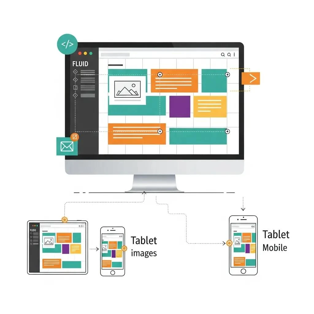
A flexible layout changes with the available screen width. Columns may stack, images may resize, and navigation may change form. Keep the content’s reading order understandable when those changes happen.
Next, test your actual text and media. Long headings, wide tables, and detailed images can reveal problems that a demonstration page misses. In addition, review narrow, intermediate, and wide screen sizes.
For background, consult MDN’s responsive design guide. Apply the relevant principles to your own content. A layout technique is useful when it helps visitors understand and use the page.
Improve user engagement with clear navigation
Responsive design and user engagement depend on clear routes to useful information. Use familiar menu labels and group related pages together. Visitors should be able to predict where a link leads.
Then open the mobile menu and follow a complete journey. Check how it closes and whether you can return to the page. Review sticky headers and banners that might cover the next control.
- Use specific labels for important actions.
- Leave useful space between touch controls.
- Keep essential information near the task it supports.
- Remove outdated or misleading links.
Make content easy to read and act on
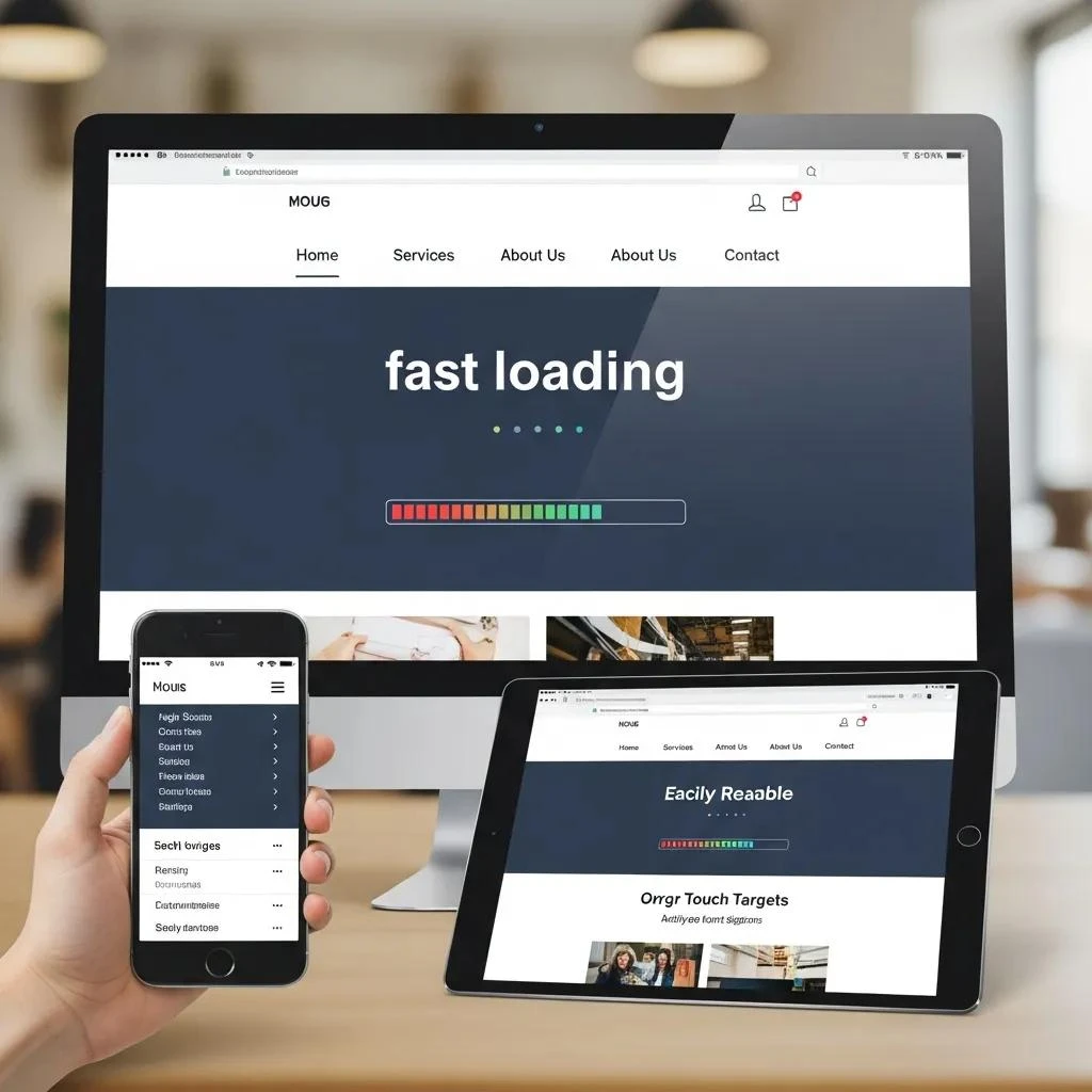
For clarity, use short paragraphs and headings that explain the next section. Put the main answer near the start of a page when that suits the task. Avoid a long introduction that delays useful information.
Also choose images that explain the subject. Write accurate alt text for meaningful images and keep important instructions available as text. A graphic that shrinks on a phone should not become the only source of essential information.
For user engagement, a clear next step matters more than repeated promotional buttons. Explain what happens after someone selects a control. Make the invitation match the information on the page.
Review forms and loading behavior
Responsive design should support the entire interaction. For example, complete a form on a phone with the keyboard open and check whether all controls remain reachable. Review errors and the final confirmation.
Next, navigate with a keyboard on a larger screen. Check visible focus, field labels, and the order of controls. These checks support usability, although a complete accessibility review has its own scope.
Also observe what appears late or moves while the page loads. A layout can fit the screen while still delaying useful content. Make focused changes and repeat important tasks afterward.
Measure responsive design and user engagement carefully
Choose measurements that match the visitor’s goal. A useful inquiry, completed purchase, successful search, or clear answer can matter more than the number of pages viewed. Review errors and customer questions alongside those actions.
Time spent on a page needs context. A longer visit can reflect interest or confusion. Likewise, a short visit can reflect a quick answer or an early exit. Therefore, combine reports with direct task observations where practical.
Then compare similar periods and record campaigns or other changes. A different result after a redesign does not prove the layout caused it. Be clear about what the evidence supports and what remains uncertain.
Use feedback to choose the next improvement
Ask visitors or team members to complete representative tasks and describe where they hesitate. Record the page, device, steps, and observed problem. Specific feedback makes design decisions easier to evaluate.
After a fix, repeat the same task and check related pages. Also, keep the result in a short issue record. Also review important journeys after content or software updates, since new elements can introduce obstacles.
Finally, connect website improvements with your wider business plan. Our digital marketing services can help discuss priorities using real pages and visitor needs. Responsive design supports a useful experience, but it does not guarantee rankings, satisfaction, or sales.
