
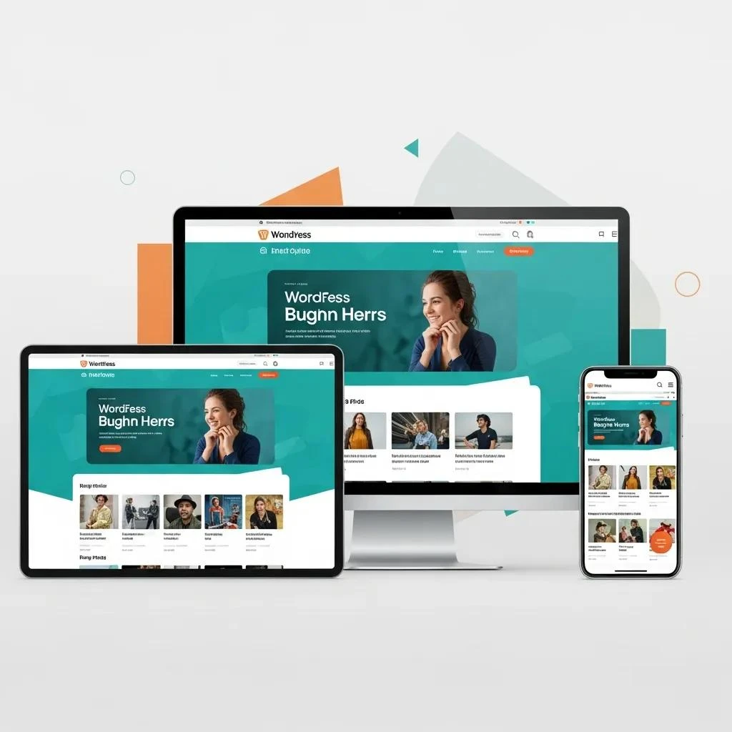
Responsive WordPress themes adapt page layouts to different screen widths. They can provide a useful foundation for a business website, but no theme alone guarantees better engagement. Your content, settings, plugins, and visitor tasks shape the final experience.
Compare themes against the same practical checklist. Review your real pages, test important actions, and confirm how your team will maintain the site. This guide explains what to look for.
Match responsive WordPress themes to visitor tasks
First, list the reasons people visit your website. A service business may need clear explanations and an inquiry form. A retailer may need product comparisons and a usable purchase journey.
Choose a few representative pages to test. Include a long article, a service or product page, and a contact page. These examples expose different layout and navigation needs.
Then identify the content that must remain easy to find on every screen. Keep these requirements in a short brief so you can compare each theme consistently. A striking homepage demonstration should not replace this review.
Test responsive themes with real content

For example, use your actual headings, images, and page sections when evaluating a layout. Demonstrations often contain carefully chosen text and pictures. A longer title or wider table can reveal a problem that the demonstration hides.
Next, check a narrow phone width, an intermediate width, and a larger desktop view. Review how columns stack and how the reading order changes. Essential information should remain understandable.
- Read normal text without sideways scrolling.
- Check menus and buttons with touch input.
- Review tables, captions, and embedded media.
- Confirm that headings still explain their sections.
Review navigation in responsive WordPress themes
A useful menu helps visitors predict where a link leads. Use familiar labels and group related pages together. Check whether the theme gives you enough control to present that structure clearly.
Then open and close the mobile menu during a real task. Follow a link, return to the page, and check the next step. A menu that fits the screen can still make navigation confusing.
Also review sticky headers and banners. They should not cover essential controls or hide the heading after a visitor follows a page link. Keep the main task reachable throughout the journey.
Evaluate loading in your complete setup
Responsive themes need testing with the content and plugins you plan to use. A clean demonstration cannot show how every added tool will behave. Note what appears late, moves unexpectedly, or prevents interaction.
Keep images appropriately sized and include only features with a clear purpose. Before adding an animation or widget, ask which visitor need it serves. Extra features also bring review and maintenance work.
When changing settings, keep a backup and use a test environment where available. Make a focused change and repeat the same tasks. Also confirm that menus, forms, and interactive features still work afterward.
Check accessibility and useful controls
Responsive WordPress themes should be reviewed beyond their appearance. Navigate important pages with a keyboard and check visible focus. Look for understandable link names, form labels, and error messages.
On a phone, complete a representative form with the on-screen keyboard open. Confirm that controls remain reachable and that the confirmation explains what happened. Avoid treating a decorative button as proof that the full task works.
These checks are a starting point rather than a complete accessibility assessment. Agree on the scope of any further review before launch. Record problems in terms of the task they prevent.
Compare editing and support needs
For responsive themes, routine editing matters as much as the first design. Try changing a heading, replacing an image, and adding a page section. Check whether the layout stays consistent without extra development.
Then review documentation, update arrangements, licenses, and support terms. Confirm what you need to pay for and who will maintain the site. Also, ask how a future theme change could affect content and page layouts.
Use WordPress documentation for platform reference. Keep notes specific to the selected theme and plugins so future editors have a practical handover.
Judge engagement with evidence
Responsive WordPress themes can help remove obstacles, but engagement depends on more than layout. Track meaningful actions such as completed inquiries, useful product views, or successful searches. Review errors and customer questions alongside those reports.
Compare similar periods and record campaigns or other changes that could affect results. A rise after a theme change does not prove the theme caused it. Use the evidence to choose the next improvement.
Finally, connect the website with your content and business priorities. Our digital marketing services can help you discuss those priorities using specific pages, visitor tasks, and current reports.
