

Ecommerce navigation connects a shopper’s intent with the right product. When categories, search, and filters are easy to use, customers have fewer obstacles between arriving at your store and deciding what to buy.
Improving navigation starts with the way people shop. A visitor who knows a product name needs a different route from someone comparing options. Your store should support both without making the menu carry every detail.
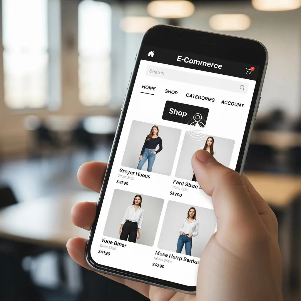
Organize categories around customer language
Use labels that describe what people expect to find. Internal department names and clever phrases may be familiar to your team but unclear to a new customer. Group products into categories that make sense from the shopper’s perspective.
For example, a home-goods store might use Lighting, Rugs, and Furniture as main categories, then offer more specific choices within each. Avoid making visitors open several vague categories to discover where a product belongs.
Give filters a specific job
Filters should reflect meaningful differences in your catalog. Size, material, color, availability, and price can help people narrow a large selection. The useful combination depends on what you sell.
- Show which filters are active and make them easy to remove.
- Provide a clear way to reset the selection.
- Help shoppers recover when their choices produce no results.
- Keep important filter controls usable on smaller screens.
Check the underlying product data too. A material filter will disappoint shoppers if product attributes are missing or inconsistent.
Make product search useful
Place search where shoppers can find it and test queries customers actually use. Include product names, common category terms, and plausible variations. Review zero-result searches to identify gaps in terminology or inventory.
A no-results page should help someone continue. Suggest a broader query, relevant categories, or a way to ask for help. Do not leave the shopper at a dead end.
Use breadcrumbs to show location
A breadcrumb such as Home > Lighting > Table Lamps shows where a product sits in the catalog and offers a route back to its category. This is usually a site hierarchy, not a complete record of every page the visitor opened.
Keep labels readable and make parent categories clickable. Also check whether returning from a product preserves useful browsing context, such as selected filters.
Test mobile navigation as a shopping task
A menu that opens is only the beginning. Ask someone to find a specific product, compare alternatives, choose a variation, and reach the cart using a phone.
Watch for filters that are hard to close, oversized overlays, hidden cart controls, and buttons covered by sticky headers. Check that important product information remains easy to find before a shopper commits.
Measure whether changes help
Choose a clear question for each change. For example: does clearer category labeling help visitors reach relevant product pages? Review product-list clicks, use of search, add-to-cart activity, and completed purchases where your tracking supports them.
Compare similar periods and note promotions, stock changes, and traffic differences. A rise in purchases after a menu change does not by itself prove the menu caused the increase. User testing can help explain what the numbers suggest.
A practical navigation review
- List the most common products and shopping tasks.
- Check whether category labels match those tasks.
- Test search and filters using real catalog examples.
- Complete a mobile shopping journey.
- Fix the most disruptive obstacles first.
- Repeat the checks and review the results.
Run a simple ecommerce navigation task test
Choose three shopping tasks before asking someone to review your store. First, include a task with an exact product name. Next, choose a task that requires browsing, such as finding a gift within a budget. Finally, include a comparison task where the shopper must check size, material, or another useful detail.
Give the tester a goal without explaining which menu or filter to use. For example, ask them to find a washable rug for a small room. Then, watch the route they choose. Avoid guiding them, because a helpful hint can hide a navigation problem that other shoppers will encounter.
Record confusion as well as failed tasks
Note where the person pauses, changes direction, or repeats a search. Also, record labels they misunderstand and information they expect but cannot find. A completed task can still reveal unnecessary effort. Ask the tester to describe what they expected at each confusing step.
Afterward, group the findings by cause. Unclear category names need different work from missing product attributes or a filter that fails on mobile. Start with issues that repeatedly block useful product discovery.
Then, test the revised path with the same task and, where possible, another person. Keep a brief record of the change and its outcome. This gives your ecommerce navigation review a practical focus and helps your team improve the shopping experience one clear problem at a time.
Frequently asked questions
Should every product appear in the main menu?
Usually the menu should provide useful category routes rather than list the entire catalog. Product search and filters can handle more detailed discovery.
Will better navigation guarantee more sales?
No. It can reduce friction, but pricing, availability, product information, trust, and checkout also affect purchasing decisions.
Build a clearer path to purchase
For broader layout principles, see our website navigation guide. If your store needs structural improvements, explore MWD’s Shopify web design services and discuss the shopping journeys that matter most to your business.
About the author
Patrick Mabarak writes about web design, website development, and digital marketing at MWD Web Design, Inc. Learn more at patrickmabarak.com.
