

Responsive design vs. cross-browser compatibility is a comparison of two different checks. Responsive design addresses how a website adapts to screen sizes. Cross-browser compatibility addresses whether its content and features work in the browsers your visitors use.
Your business needs both. A page can fit a phone screen and still have a broken menu in one browser. It can also work in several desktop browsers while being difficult to read or navigate on a phone.
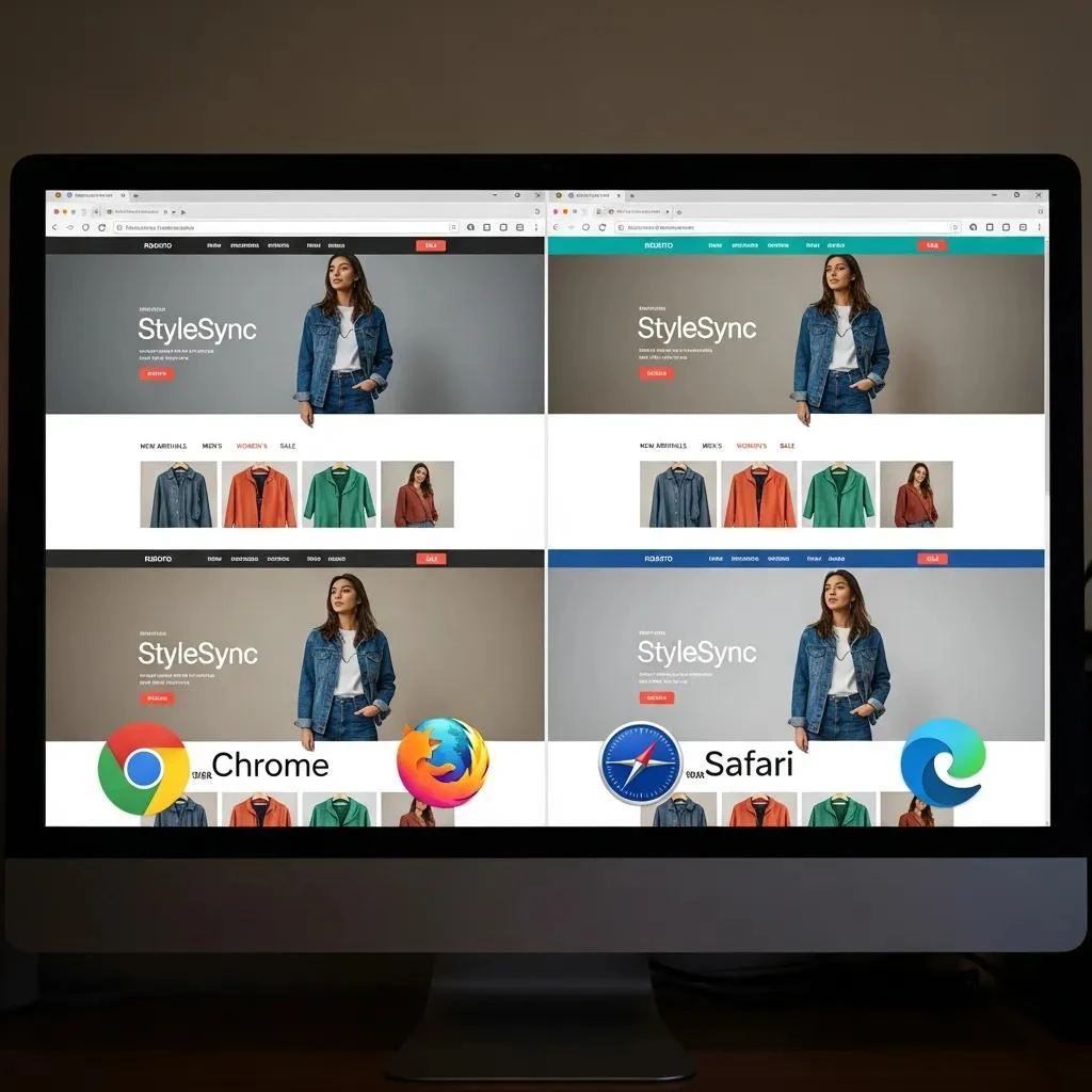
What responsive design covers
A responsive layout adjusts to the available space. Text should remain readable, images should fit their containers, and navigation should remain usable as the screen narrows.
Flexible layouts and media queries help developers adapt page elements. The practical test is whether visitors can complete their tasks without awkward zooming, clipped content, or controls that are difficult to use.
What cross-browser compatibility covers
Browsers can differ in how they support or display website features. Compatibility testing looks for problems such as a form that cannot be submitted, a menu that will not open, or an important element that disappears.
The objective is a usable, reliable experience. Minor visual differences do not always require a fix, but a difference that prevents someone from contacting you or buying a product does.
Why one check cannot replace the other
Consider an appointment form. On a narrow screen, responsive testing checks that labels, fields, and the submit button fit. Browser testing checks that date selection, validation, and submission work in the agreed browser environments.
Resizing a desktop browser is helpful for checking layouts. It does not fully reproduce a real phone’s keyboard, touch behavior, operating system, or browser. Include real-device checks for important journeys where practical.
Build a testing plan around visitor tasks
Agree on a manageable set of browsers and devices based on your audience and available analytics. Include relevant mobile and desktop environments. Record versions when reporting a problem so the developer can reproduce it.
- Navigation: Open menus, follow important links, and move between sections.
- Forms: Enter valid and invalid information, submit the form, and verify delivery.
- Purchases or bookings: Test required steps in a suitable test environment.
- Layout: Check long headings, images, tables, and content near screen edges.
- Input: Check touch interaction and keyboard navigation.
- Feedback: Ensure errors and confirmation messages are clear and visible.
Include accessibility and performance
A responsive website is not automatically accessible. Check readable contrast, visible keyboard focus, meaningful form labels, and whether content remains usable when enlarged. These checks complement a more thorough accessibility review.
Likewise, a layout that fits a screen is not necessarily fast. Large images and unnecessary scripts can still slow it down. Evaluate performance separately, especially on mobile connections.
Record failures so they can be fixed
A useful report includes the page address, browser and device, steps taken, expected outcome, and what actually happened. A screenshot or short recording can help explain visual or interaction problems.
Prioritize blocked transactions, inaccessible content, and failed inquiries ahead of minor cosmetic differences. After a fix, repeat the affected task and check related journeys for unintended effects.
Use a small release checklist for every change
Responsive design vs. cross-browser compatibility becomes easier to manage when each release has a clear checklist. Start by naming the feature that changed and the visitor tasks it could affect. For example, a new header may alter navigation on every page, while a revised form may affect only one inquiry path.
Next, choose a few representative pages. Include a page with a long heading, a page with an image, and any page containing the changed feature. Then, test the important tasks in your agreed browser and device combinations. Record the results so the next reviewer can see what you checked.
Make the expected result explicit
A note that says “check the menu” leaves room for interpretation. Instead, describe the full task: open the menu, choose a service, return to the previous page, and close the menu. Also, check whether keyboard users can follow the same path and see where focus moves.
If you find a problem, record its effect on the visitor. A clipped label may confuse someone, while a hidden submit button may block an inquiry entirely. This distinction helps your team decide which fixes need attention first.
Finally, keep the checklist short enough to repeat. Add new checks when a real issue reveals a gap, and remove obsolete ones when features change. A maintained checklist makes routine updates more reliable without requiring your team to redesign its testing process every time.
Frequently asked questions
Do all browsers need to look identical?
No. Focus on consistent access to content and working features. Agree on the browsers you support and what differences are acceptable.
Can automated tests do everything?
Automated checks can help catch repeated failures, but manual review is still useful for layout, clarity, and real-world interaction.
When should testing happen?
Test during development, before launch, and after changes that affect important functionality. Testing only at the end leaves less time to fix problems.
Plan for the devices your customers use
MWD’s responsive web design services include cross-device design and testing. Combine this with clear website navigation so visitors can reach the next step across the environments that matter to your business.
About the author
Patrick Mabarak writes about web design, website development, and digital marketing at MWD Web Design, Inc. Learn more at patrickmabarak.com.
